Advertisements are meant to look polished, clear, and professional, but one small editing mistake can change the whole message. These examples show awkward crops, strange reflections, floating objects, confusing proportions, and design choices that should have been caught before printing. The humor comes from the layout and editing, not the people in the images. Each photo shows how one overlooked detail can turn a normal advertisement into something unexpectedly funny.
1. Family ad with a floating portrait effect
This home advertisement looks warm at first, with two adults and a small dog standing by a staircase. Then the lower halves of the figures seem to disappear behind the railing, making the group look as if they are floating in place. The edit may have been meant to blend the scene cleanly, but it removes too much visual information. The result is a cozy family image with an accidental floating effect.
2. Toy piano reflection with two faces
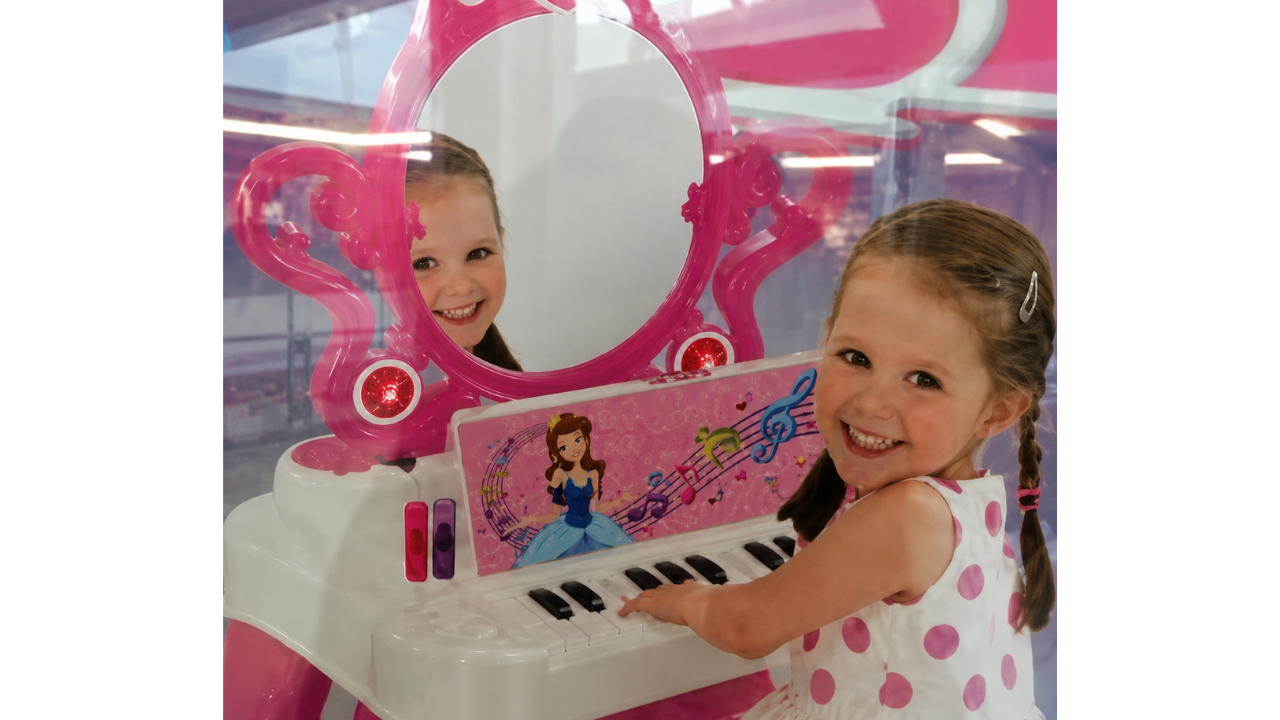
This toy advertisement becomes confusing because the mirror does not reflect the scene in a natural way. One smiling face appears in the mirror area, while another child is shown playing the small pink piano in front. Instead of showing the toy clearly, the reflection creates a strange double-image effect. It is a small editing choice that makes the whole ad feel unintentionally funny.
3. Floating arm in a baby bath ad
This baby bath product photo looks normal until the adult arm appears without the rest of the person in frame. The hand is reaching in to help, but the crop makes the arm seem to float into the bathtub scene. The product itself is clear, yet the edit pulls attention away from it. A wider crop would have made the moment feel much more natural.
4. Horse photo with a confusing crop
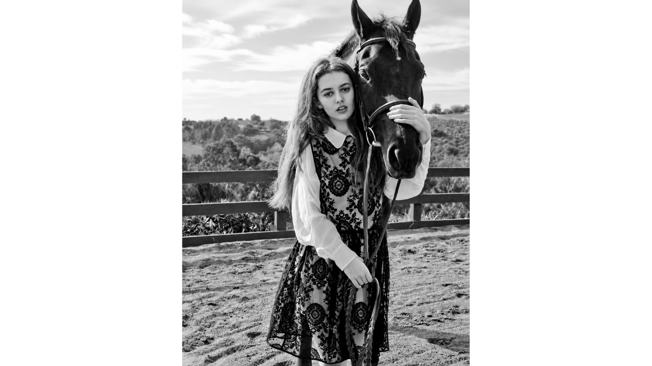
This fashion-style image shows a model standing beside a horse, but the crop makes the horse's body hard to understand. Only the head and part of the neck are easy to see, which makes the animal look oddly incomplete at first glance. The black-and-white styling gives the photo a serious mood, but the visual confusion steals attention. It turns an elegant setup into a strangely puzzling ad image.
5. Swimmer poster with an unusual arm edit
This swim membership poster tries to look energetic, but the raised arm appears much longer than expected. The pose may have been stretched or placed awkwardly during the design process. Once noticed, the arm becomes the main detail instead of the pool promotion. It is a reminder that action shots still need careful layout and editing.
6. Fashion pose with an unusual leg angle
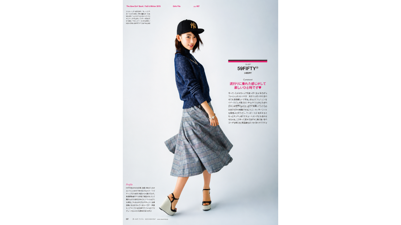
This magazine-style outfit photo has a polished layout, but the leg position looks visually confusing. The foot and ankle appear turned in a way that does not line up naturally with the rest of the pose. Fashion images often use dramatic stances, but this one looks more like an editing or posing oversight. The outfit is clear, but the unusual angle quickly takes over the page.
7. Airline ad with a very low view
This travel ad shows a passenger looking out of an airplane window at the Statue of Liberty. The issue is the scale, because the landmark appears so close that the plane seems unrealistically low. The image was likely meant to suggest an exciting view, but it ends up looking more confusing than convincing. The idea is clear, but the exaggerated placement makes the edit stand out.
8. Guitar cover with floating instruments
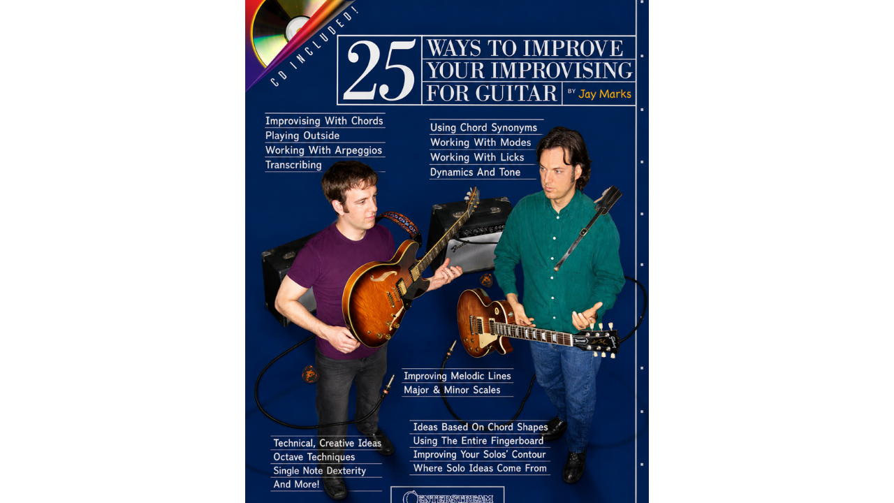
This guitar lesson cover has a noticeable problem for something meant to teach playing technique. The guitars do not appear to sit naturally in the players' hands, making the instruments look pasted into the scene. That is especially distracting on a cover about improving guitar skills. The design may explain the lessons, but the instruments should have looked more believable.
9. Selfie stick ad facing the wrong way
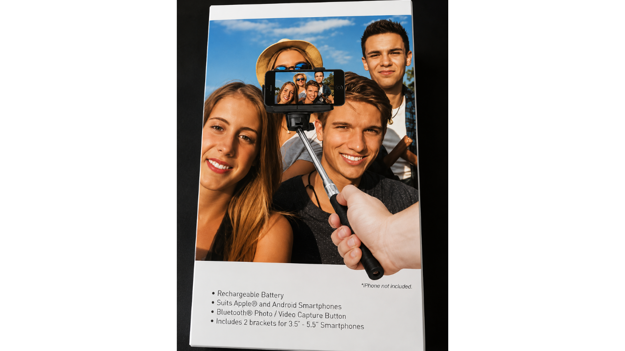
This selfie stick package is funny because the product demonstration seems to miss the point. The phone on the stick is facing the group, but the printed setup makes the angle look awkward and confusing. A selfie stick should make taking group photos easier, not harder to understand. Even the small note saying the phone is not included adds to the oddness.
10. Rice dish with floating peas
This food ad looks simple until the peas on top of the rice start to seem suspicious. They appear too evenly placed and slightly disconnected from the dish, almost as if they are hovering. Instead of making the meal look more natural, the garnish draws attention to the editing. A more realistic food photo would have made the dish feel much more believable.
Comments (0)
No comments yet. Be the first to share your thoughts!